
Riverside announces winner of logo concept competition
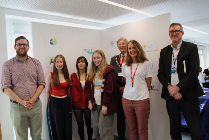
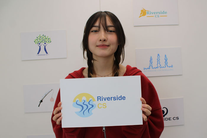

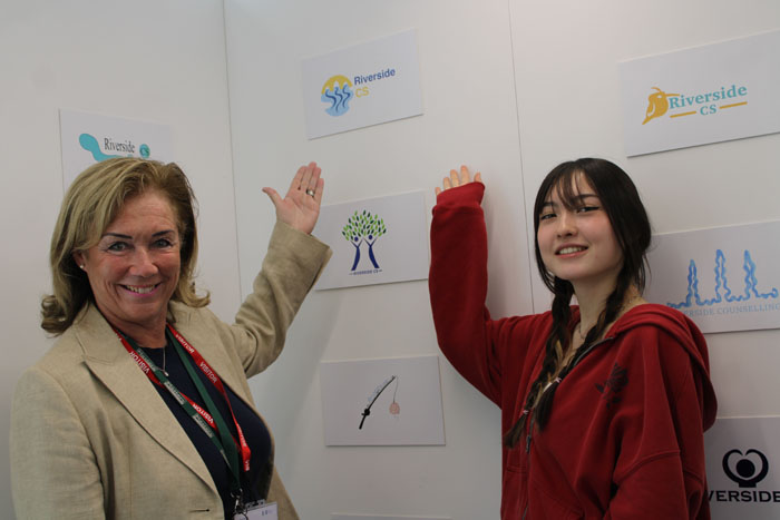
Riverside Counselling Service this week announced that Mio A’court’s design had been selected as the winning entry in its collaborative logo competition with The Henley College.
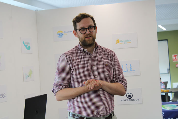
The competition was launched in May inviting art students to come up with a design that reflects the charity’s work and values. The winner was decided by a panel of judges from Riverside and local graphic designer Ben Hargreaves from in8.
Riverside CEO Sophie Welling said, “Our logo is a little bit outdated. We have also been looking at our values, mission and vision so we wanted all these things to coincide, to come together and to create some change for the organisation in terms of our external face and how we present ourselves. We have previously worked and got a good relationship with Henley College so we thought it was a really good opportunity for the two of us to come together to do this competition to generate a concept that could be worked up into a logo for Riverside.”
Mio’s winning design stood out to the judges because it aligned with Riverside’s values and community orientation. Sophie added, “We felt that it denotes Henley, but not just Henley because we do work beyond Henley. The design has a river in it and we are Riverside. We felt that it was something that we really wanted to hold on to. Our current logo has water in it. For those of a certain age, Simon and Garfunkel and their song Bridge Over Trouble Water; there’s an underlying message there about water, a bridge and Riverside being that connection. We also liked the colours.”
“We felt that it was a really a beautiful piece of art and just very representative of who Riverside is; what we do both in terms of the name and our work. It is uplifting and really nice that it’s been designed by a young person who is at the local college and very representative of the community orientation of Riverside and what we’re about and who we support.”
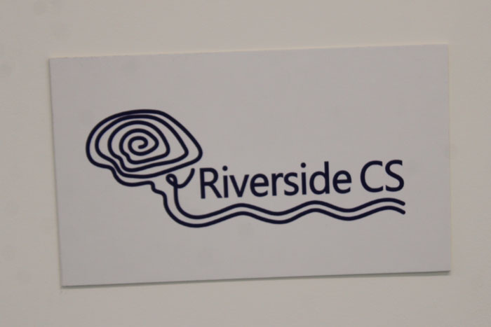
Mio said, “I was quite surprised I won. I really liked the design with the brain going into the river. I created the logo using an app on my iPad. I made a circle for the main shape and then I drew the design inside to make it a clean design. It is the first time creating a logo. At first, I started creating it using Adobe Illustrator which was quite difficult, and then I found hand drawing it was a lot easier. I’m pleased that the judges thought my design reflected who Riverside is.”
The runners-up were Erin Moses and Grace Brown.
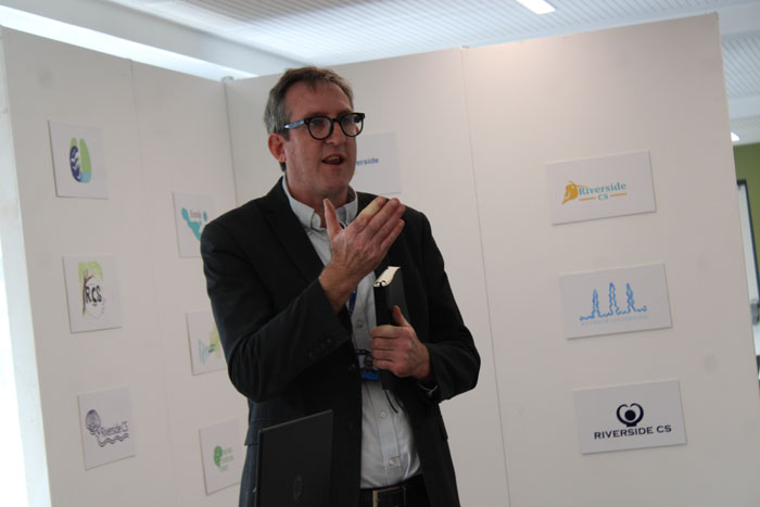
The Henley College Principal, Simon Spearman said, “Thank you to the students for participating and creating some amazing work. It’s a great collaboration between us and Riverside Counselling.”
Henley & Thame MP, Freddie van Mierlo said, “I think Riverside are an incredibly important charity. I have regularly had talking therapies over the past 10 years. I think it’s very important that we normalise that and it is a really important part of wellbeing and good mental health. Unfortunately, the availability of talking therapies in this country is very restricted. It’s very difficult to get hold of it on the NHS. Many people are forced into the private sector and pay a lot of money. I’d like to see the charity thrive because the work they do is so important. I know having a good logo and a good marketing presence is an important part of that. It’s great to see the collaboration between a local charity and the college. These are all wonderful designs. I think if nothing else, they really prove to me that AI has got a long way to go before they can meet the creativity of the human brain. Huge congratulations to those who made the top three.”
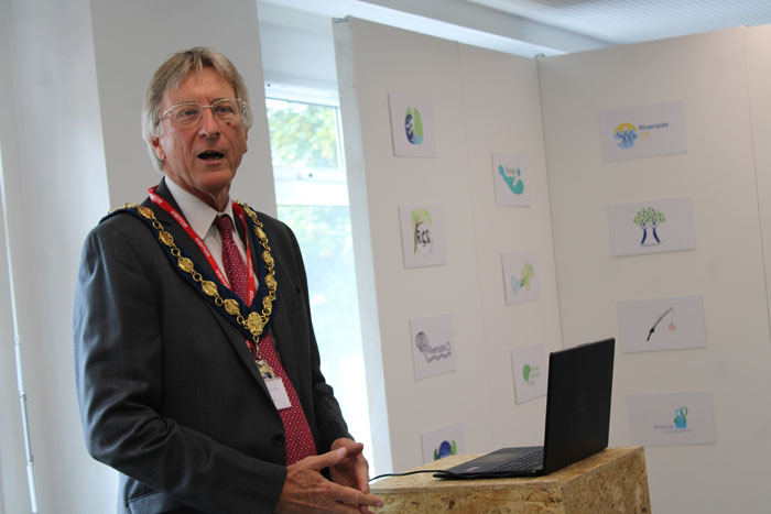
Henley Mayor, Councillor Ian Reissman said, “Counselling and mental health is undervalued. It’s becoming more recognised as important, but it still has a bit of a Cinderella image. I also had some difficulties in my life a few years ago, and I decided to take up the offer of counselling, and it was really helpful.”
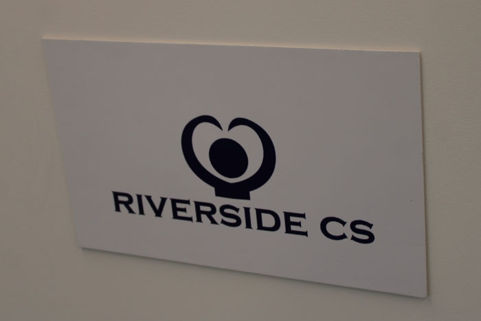
Ian really liked the design with a heart hugging a person. He commented, “One of the things my counsellor used to say to me was that we’re all mammals and we need to have feelings. We need to be warm; we need to feel comfortable and safe. The design is a combination of the heart shape representing our feelings combined with a human hugging. That’s something that my counsellor taught me to do is if you haven’t got someone to hug, hug yourself.”
The winning logo concept will now be developed by Ben at in8, who has generously offered to provide his design services free of charge.


Leave a Comment
Want to join the discussion?Feel free to contribute!